Harmen Liemburg

Originally trained as a cartographer, Harmen Liemburg is no stranger to plotting out details on an extensive scale. The way a map hints at history beyond its mere geography, so too does Harmen’s art make reference to the material culture that inspires it.
A ticket stub to an exhibition, or a flyer from a show, may be a throwaway item for many, but not for Harmen, who looks twice at the perishable objects that surround him, finding beauty in the simple practicalities of traffic signs and candy packaging.
-
During his studies at the Rietveld Academy, Harmen fell in love with screen printing, each piece a graphic adventure without a premeditated destination. An avid outdoorsman, he has learned from years of exploration that it’s not always wise to have strict expectations, or prepare a perfect plan.
Harmen prefers silkscreen printing by hand over digital printing because the pigments are stronger and the layers are thicker; this means intense neons, colors that pop, clearer contrasts, and more artistic control overall.
Such benefits, however, come at the cost of working each color separately: pasting the screen, lighting it, adjusting the table etc., step by step. “It’s a lot of work. Not for lazy people,” says Harmen jokingly when asked about the process.
Despite his high artistic renown, be it with work in the Stedelijk or impressive exhibitions abroad, his collaboration with Sidedish occurred quite spontaneously. Good friends with the owner of the framing store Sidedish works with, Harmen asked about a print by Nynke, one of our artists, as it was being framed.
Coincidentally, we happened to be talking with Nynke about artists she thought could add a new dimension to Sidedish, and she mentioned Harmen. When we contacted him, it was nice to hear he had been hoping to get in touch with us as well.


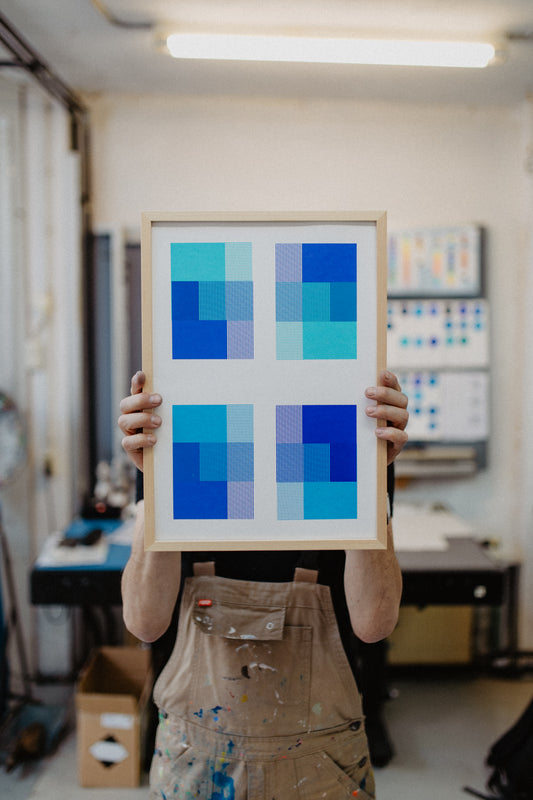
Together with Sidedish, Harmen has made a limited edition of 15 prints called ‘Blue x Blue x Blue’, as part of a broader color study inspired by the books of Monica Rotgans, a Dutch painter and author who writes about the history and use of pigments in art and industry.
‘Blue x Blue x Blue’ is an interactive play of shades, a testament to Harmen’s fluency in the cheerful language of overprinting colors.
The fine overlapping of the lines, much like woven fabric in a loom, creates texture, while a convergence of colors offers a curious puzzle for viewers to distinguish between combinations of blue. The pleasant palette conveys tranquility, the decisiveness of its range reassuring.
The negative space between the geometry lumps shapes into groups that jump, and lines that dance, as you move your eyes across the print.


From left to right: Harmen observing the subtle changes that form part of his latest colour study alongside his finished product for Sidedish Projects
-
Such liveliness is characteristic of Harmen, who emphasizes the importance of play in his designs, trying out multiple directions until eventually arriving, intuitively, at a finished product.
Not knowing the outcome of his work beforehand is Harmen’s way of having fun. But behind Harmen’s fun is a honed precision, and as enjoyable as blue may be, clearly there is more to blue than meets the eye.
It takes a good deal of tasteful scrutiny to turn research into art, and with Blue x Blue x Blue, Harmen has done exactly that.
Check out Harmen’s Limited Edition ‘Blue x Blue x Blue’ below or keep up with his latest via his website or Instagram!
Products
-
Blue x Blue x Blue
Regular price €250,00Regular priceUnit price per